

PROJECT
Truite du Moulin Esleys
Truite du Moulin Esleys
ROLE
Art Direction, Brand Identity, Illustration, Iconography
Art Direction, Brand Identity, Illustration, Iconography
YEAR
2024
2024
CLIENTS
Truite du Moulin Esleys
Truite du Moulin Esleys
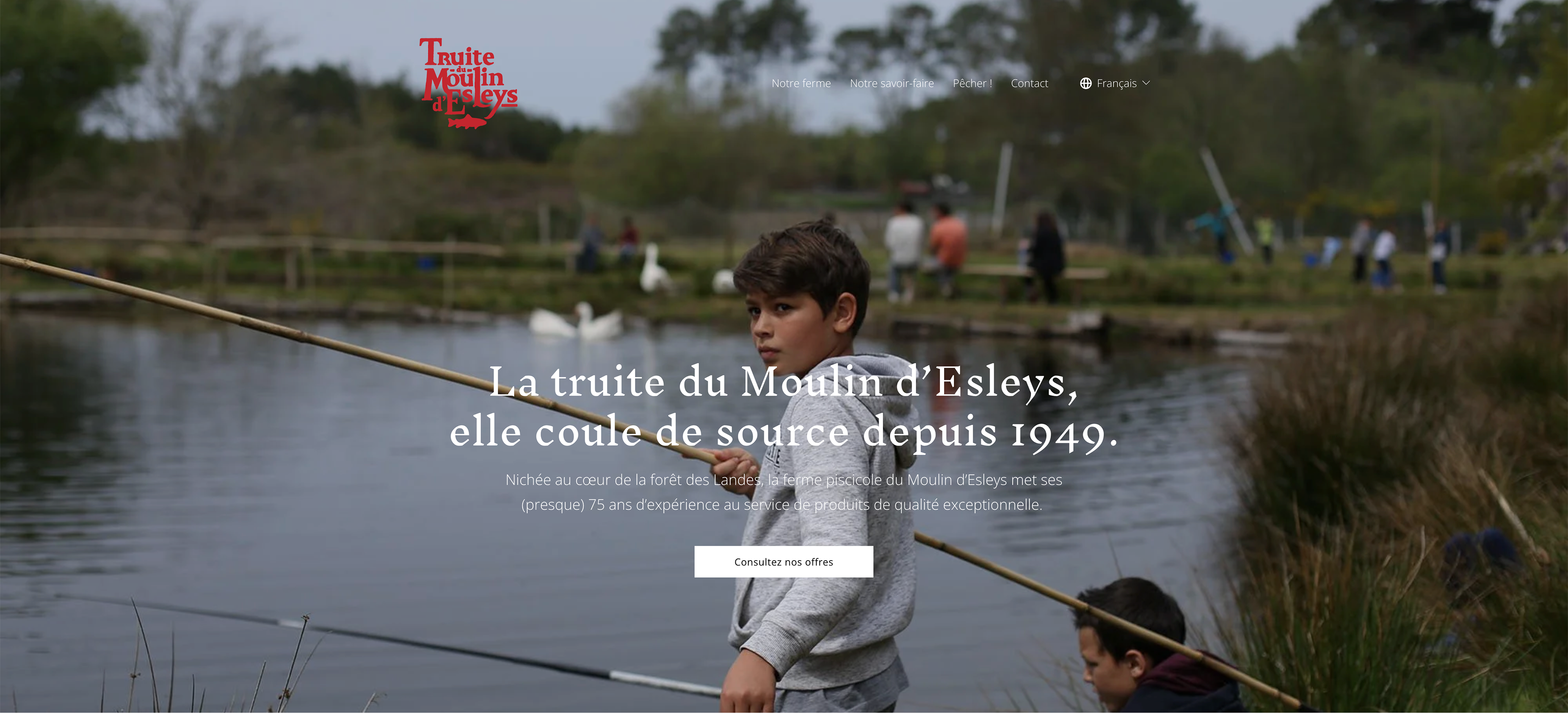
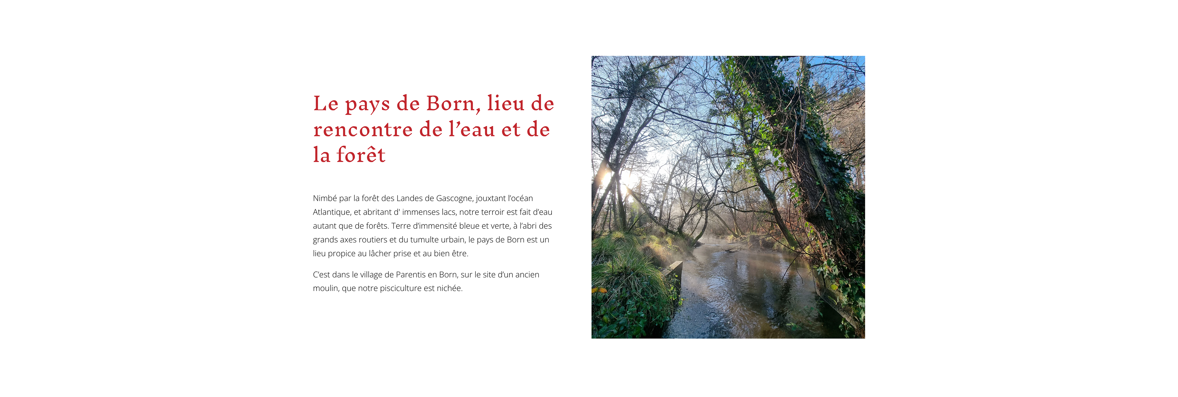
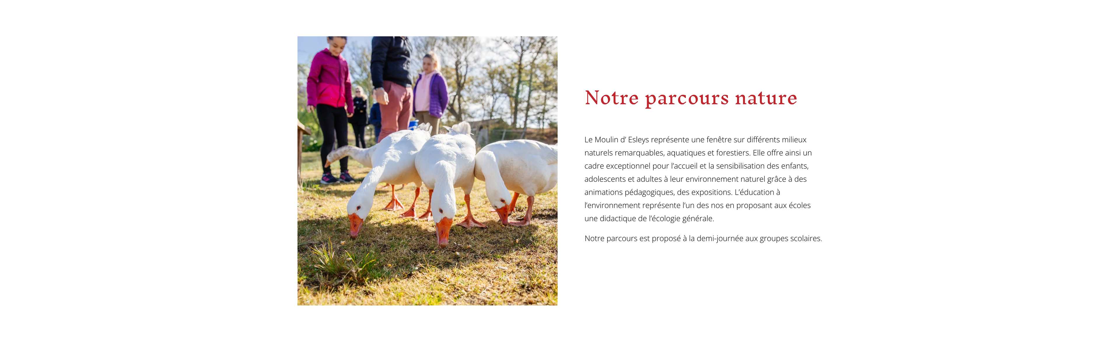
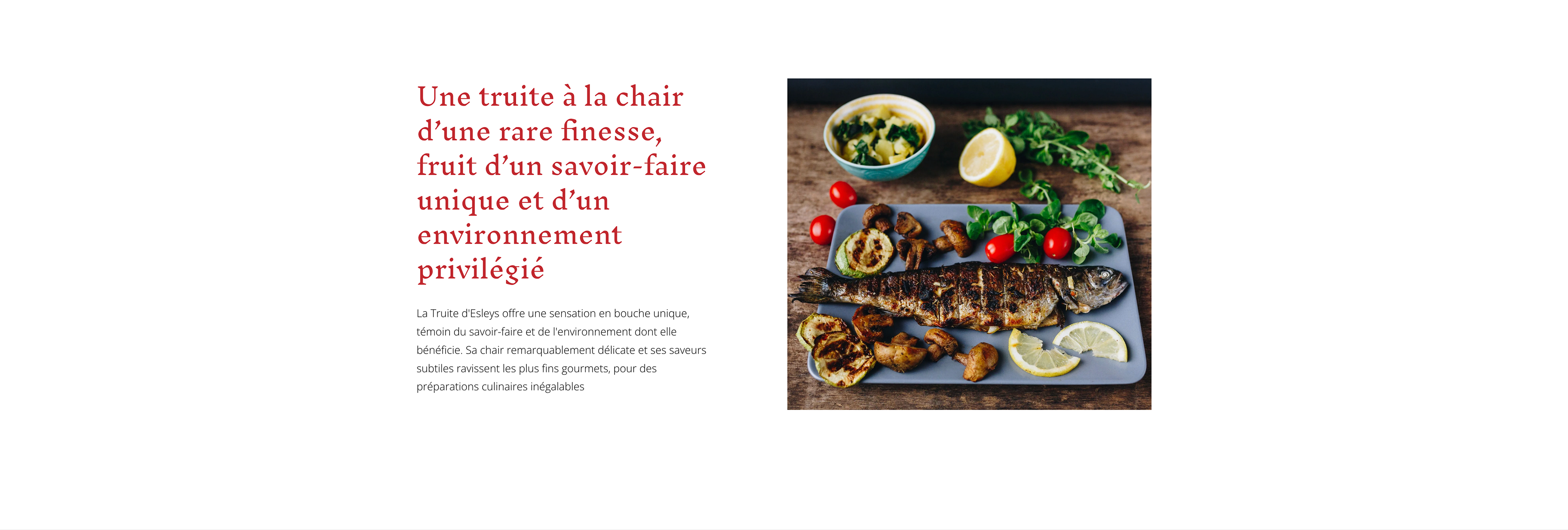
Le Moulin d’Esleys is a family-run fish farm located in the Landes region of France. Founded in 1949, the farm raises trout using sustainable methods and also opens its ponds to visitors for leisure fishing. The project required a visual identity capable of expressing the site’s artisanal heritage while remaining clear and recognizable across signage, packaging and communication materials.
Problem
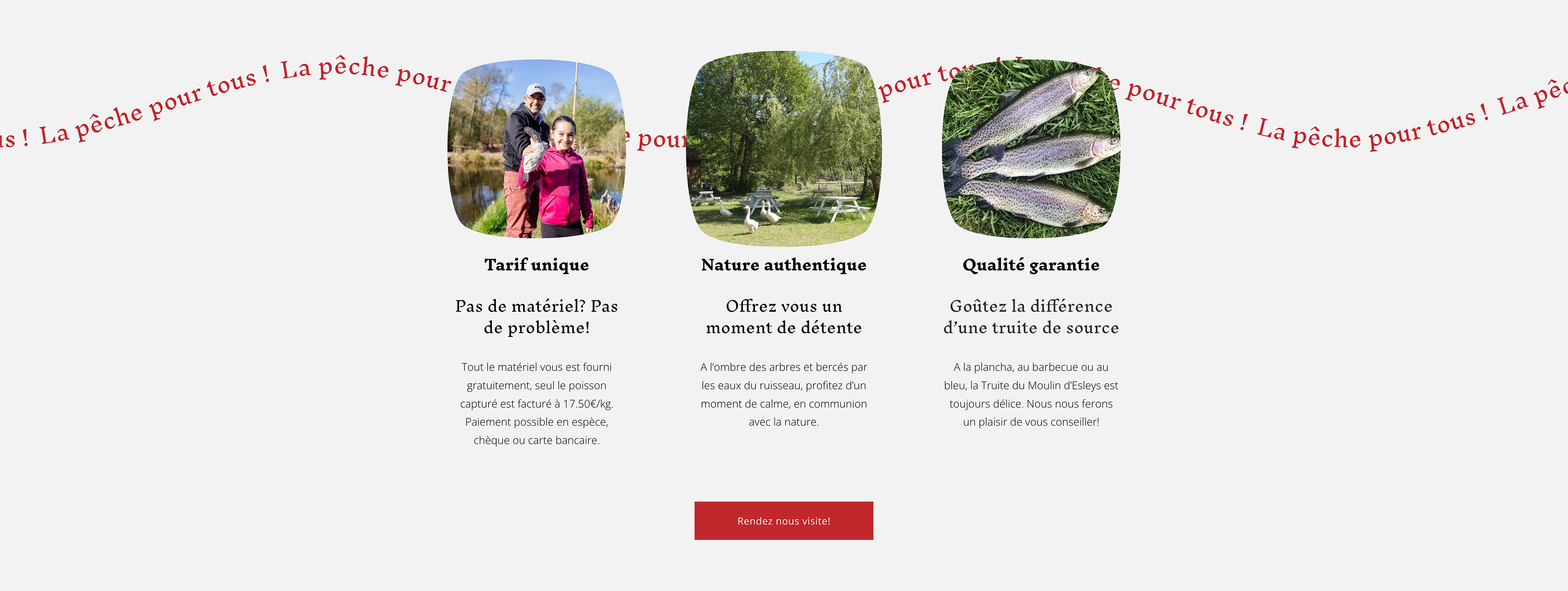
The challenge was to create an identity that reflects the authentic and family-driven character of the fish farm while appealing to a broad audience including visitors, anglers and local customers.
The identity needed to communicate tradition, nature and gastronomy while remaining flexible enough to work across a variety of applications such as signage, menus, educational materials and product packaging.
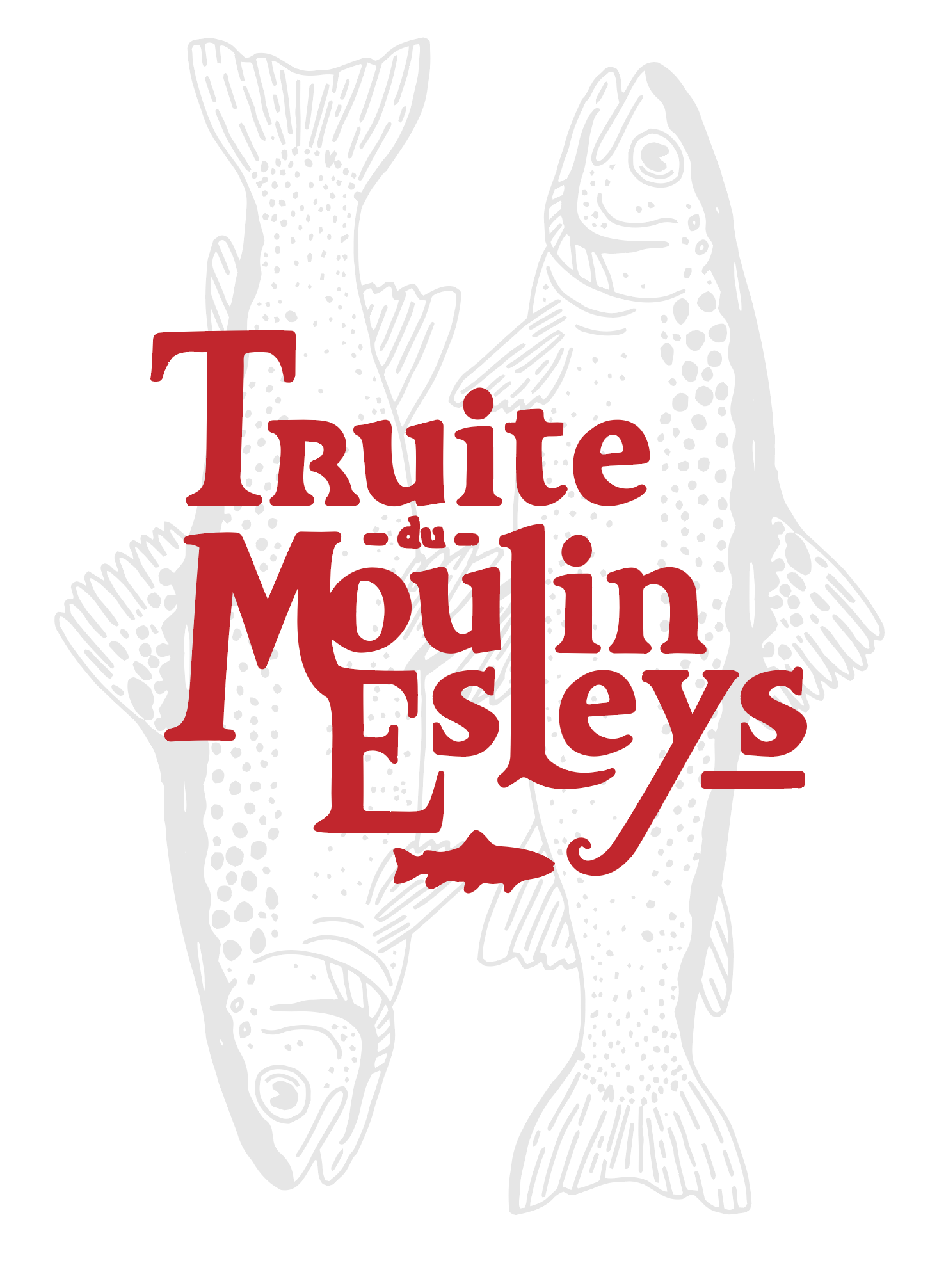
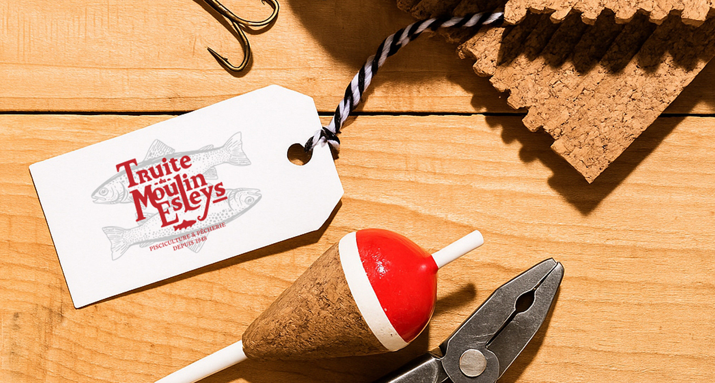
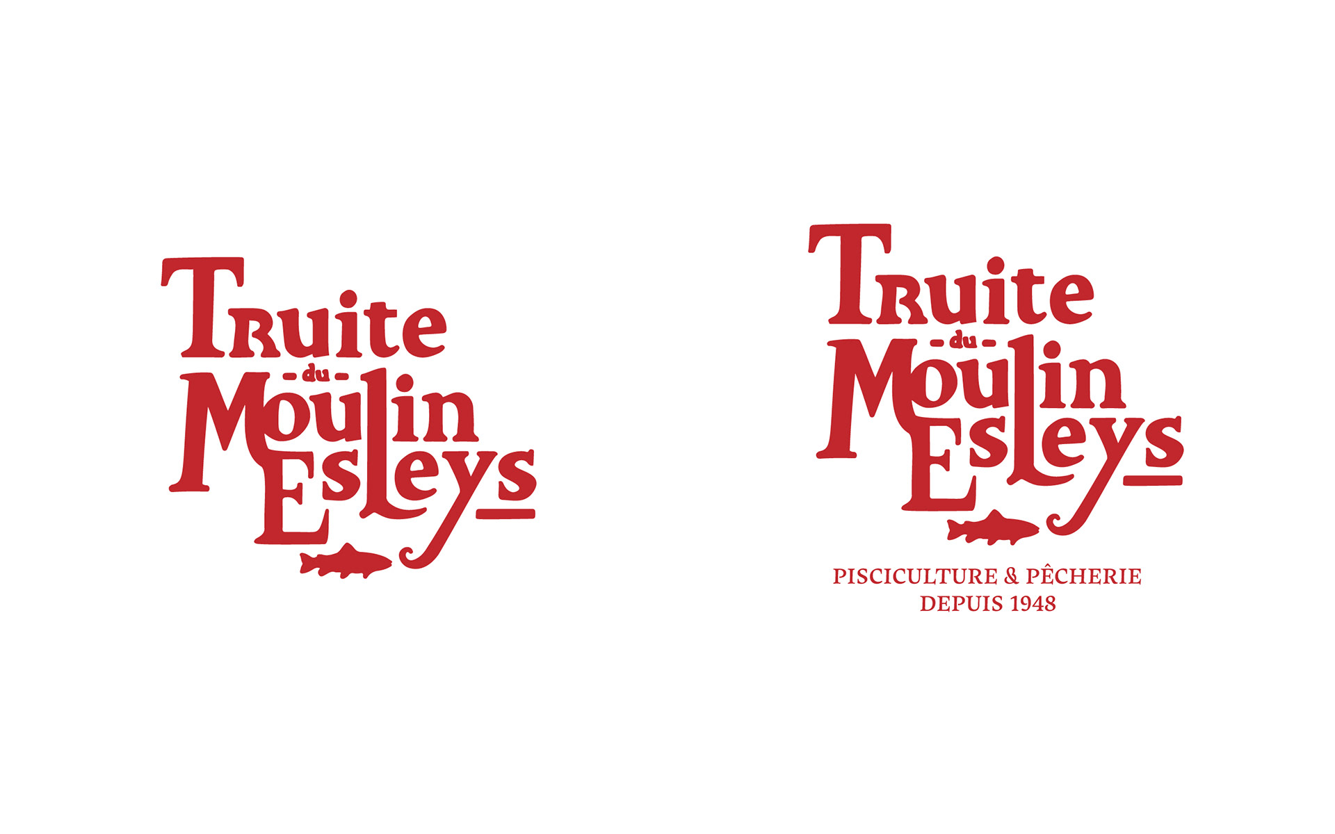
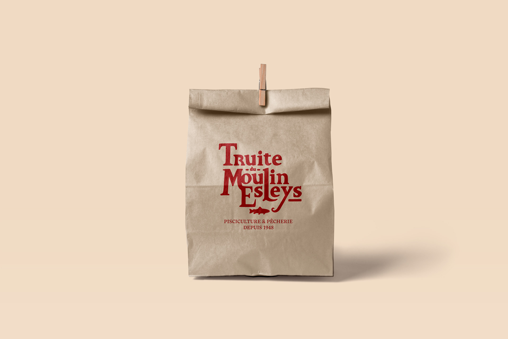
Logotype
The logotype was entirely hand-drawn, giving the brand a strong artisanal and authentic character.
The expressive lettering is paired with a trout silhouette, directly referencing the farm’s core activity. This combination creates a distinctive mark that reflects both the tradition of the place and its connection to local gastronomy.
Typography
The typographic system combines a serif display typeface (Maecenas) with Roboto for supporting text.
This pairing creates a balance between tradition and clarity, ensuring readability across different communication formats such as signage, printed material and digital content.
Color
The visual identity is built around a strong, warm red, supported by black and neutral grey tones.
This palette provides strong visual recognition while conveying warmth, authenticity and consistency across all brand applications.
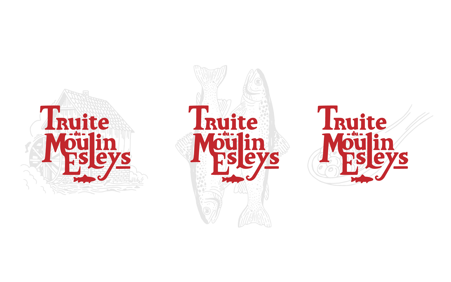
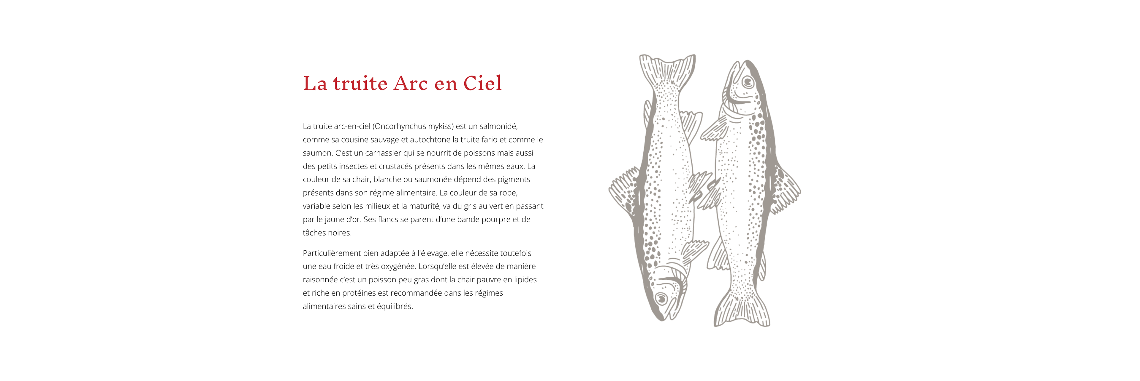
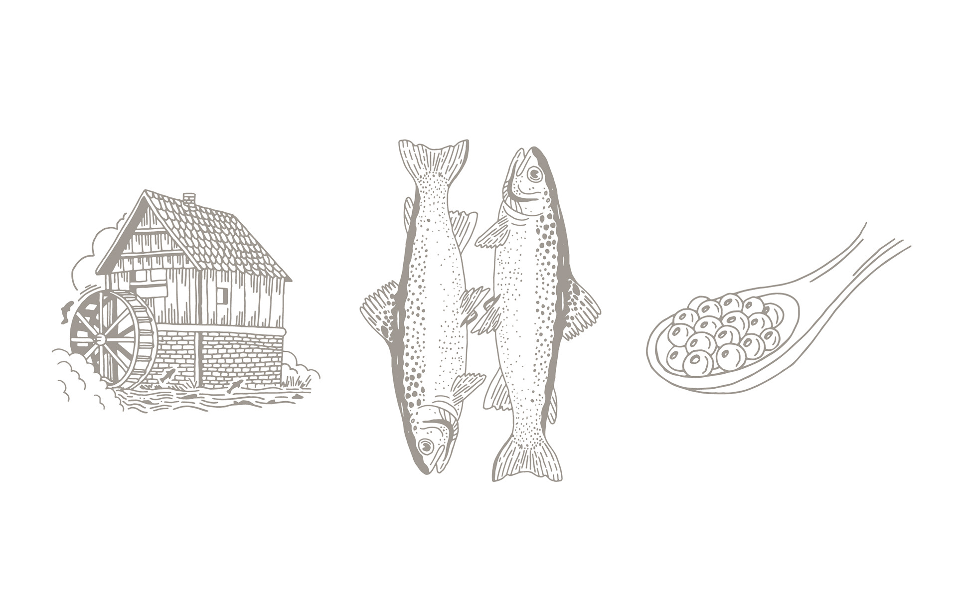
Illustration
A complete system of hand-drawn illustrations was developed to enrich the brand’s visual language.
These illustrations depict elements related to the fish farm and its environment, including the mill, trout, fishing equipment and culinary motifs. They reinforce the narrative around nature, craftsmanship and local heritage.
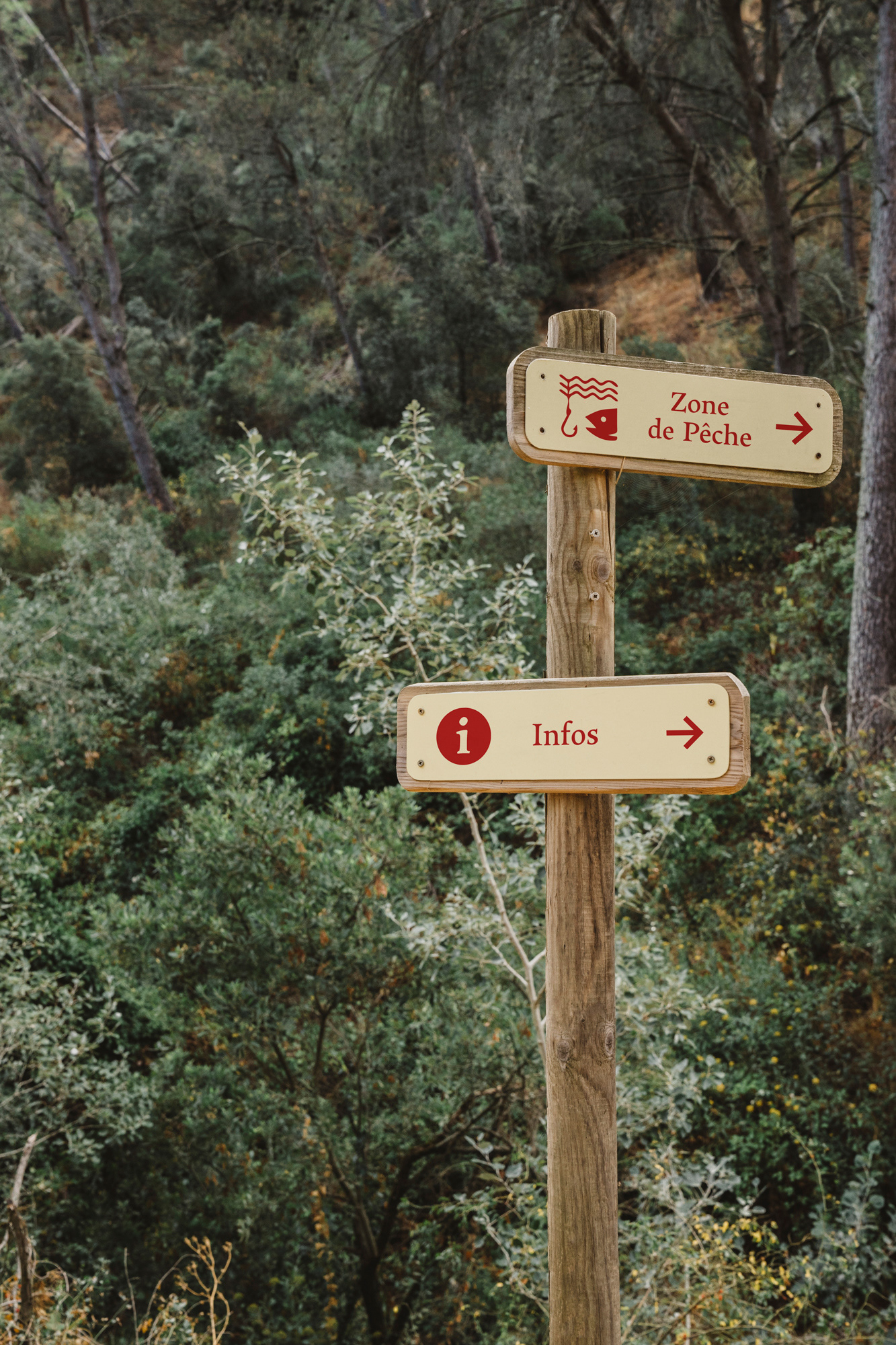
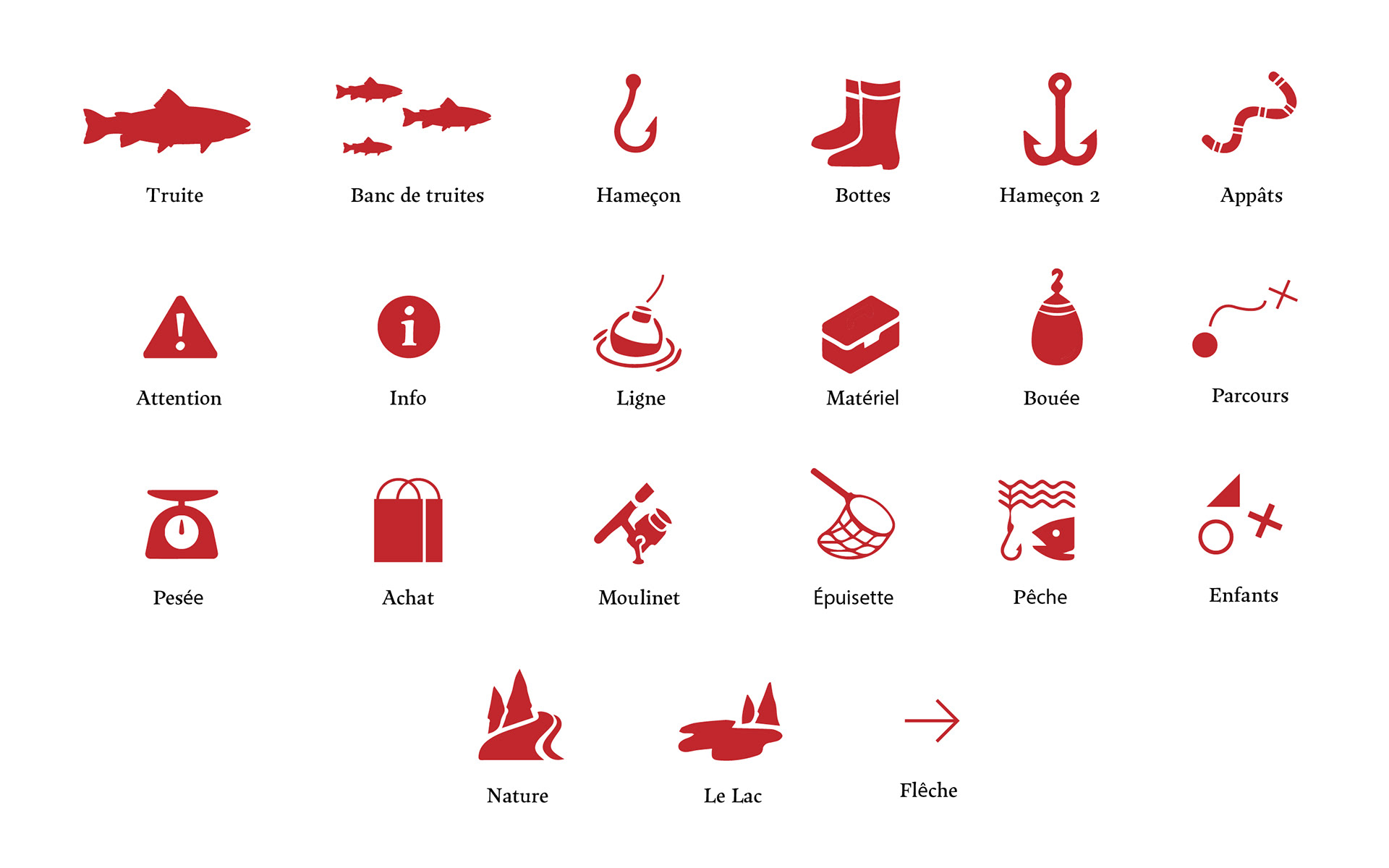
Iconography
A set of custom pictograms was designed to guide visitors and support communication around fishing activities and site services.
These icons represent elements such as hooks, boots, buoys, fishing equipment and nature, helping to structure information while maintaining a playful and accessible visual tone.
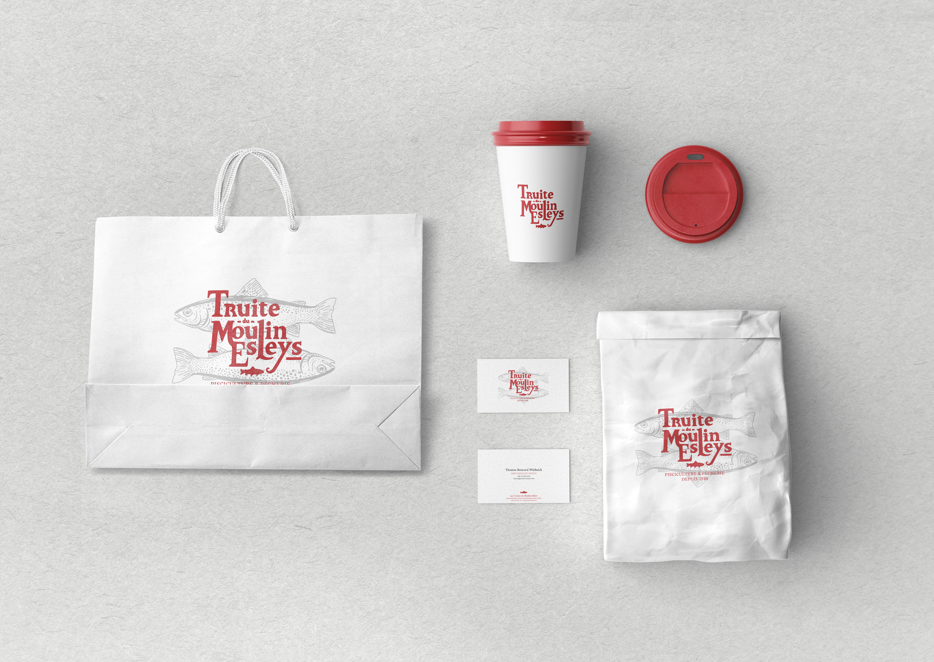
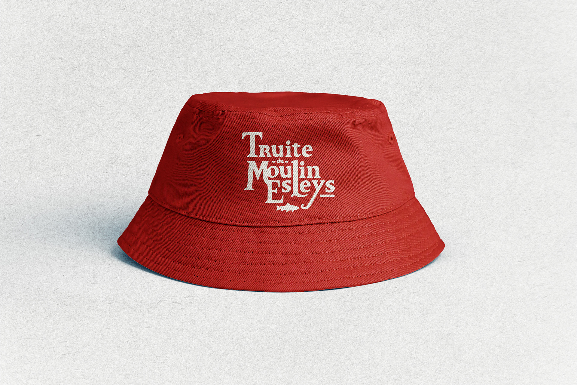
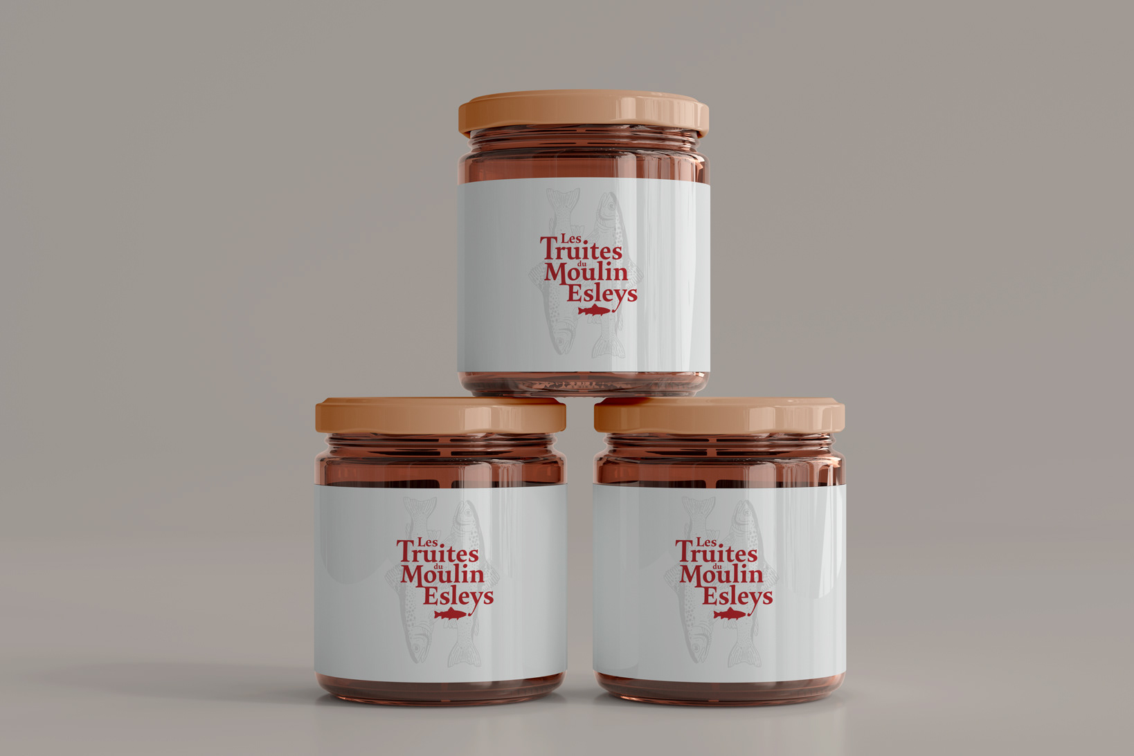
Applications
The identity is deployed across multiple supports including:
stationery and corporate material • menus and printed offers • site signage and flags • packaging for products such as trout roe • educational and informational materials for visitors.
Solution
The project resulted in a handcrafted visual identity combining illustration, typography and color into a coherent graphic system.
By emphasizing artisanal drawing, local storytelling and clear visual language, the identity gives Le Moulin d’Esleys a warm, memorable and immediately recognizable brand presence.