

PROJECT
Berlin Concept Catering
Berlin Concept Catering
ROLE
Art Direction, Brand Identity, Illustration, Iconography
Art Direction, Brand Identity, Illustration, Iconography
YEAR
2025
2025
CLIENT
Berlin Concept Catering
Berlin Concept Catering
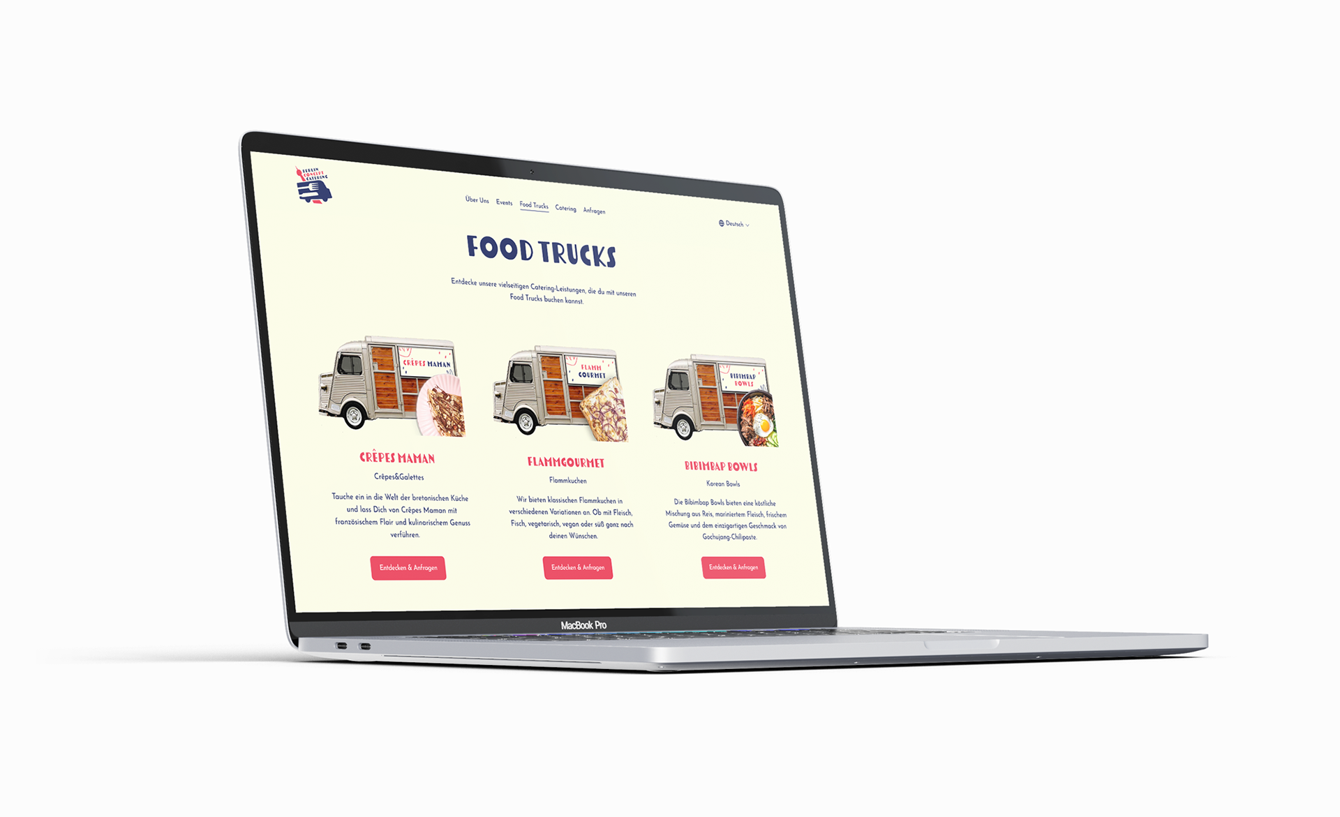
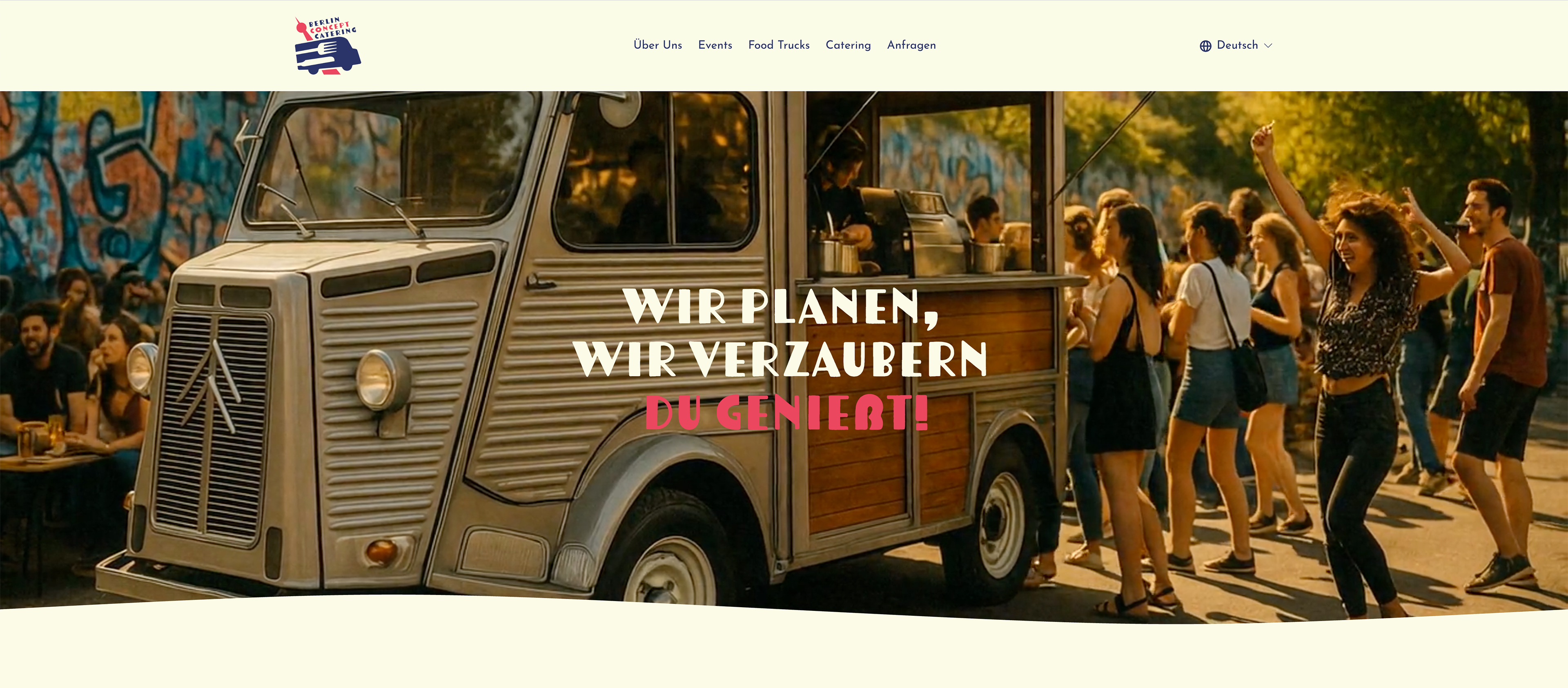
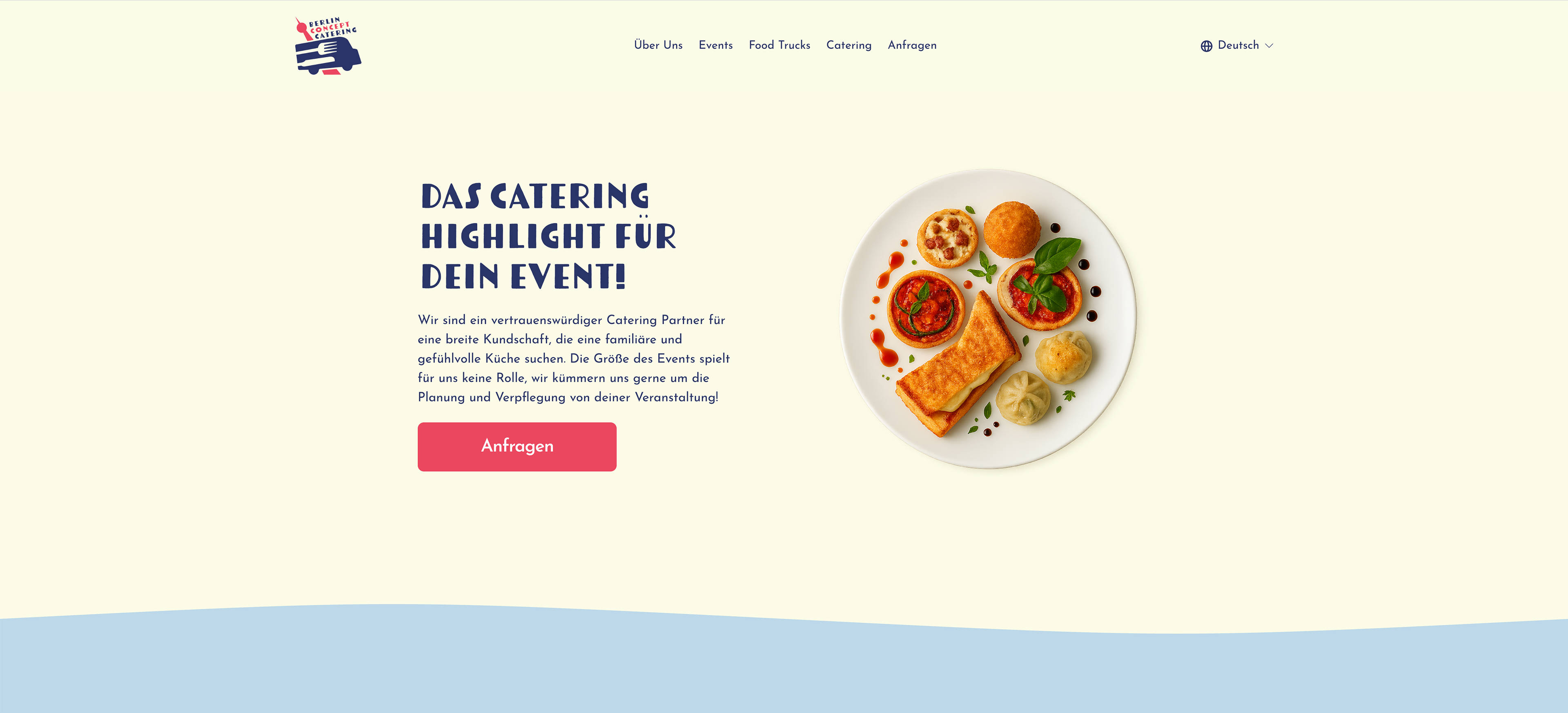
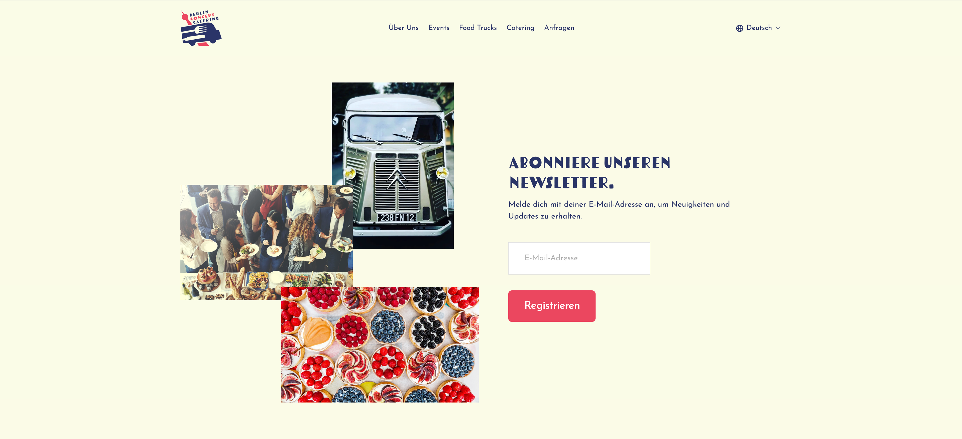
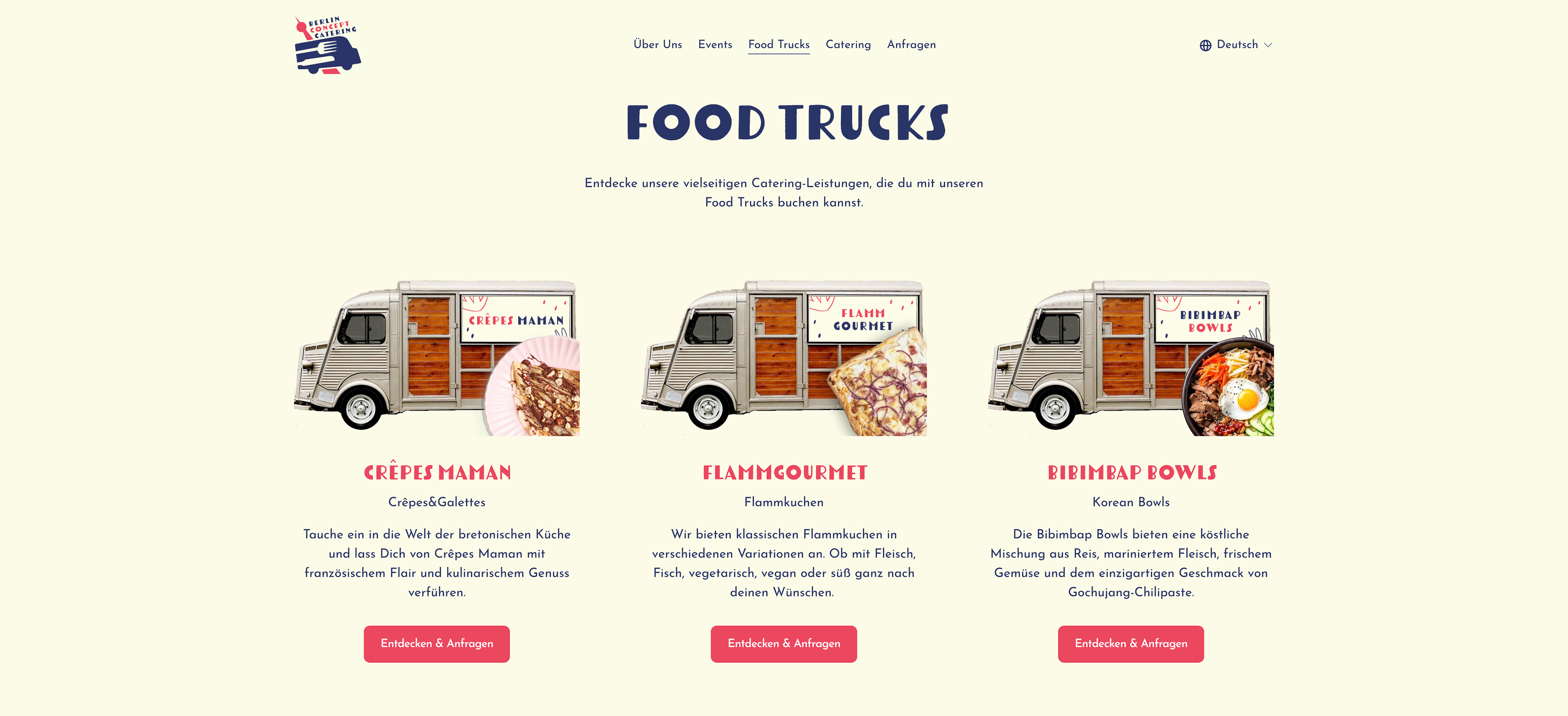
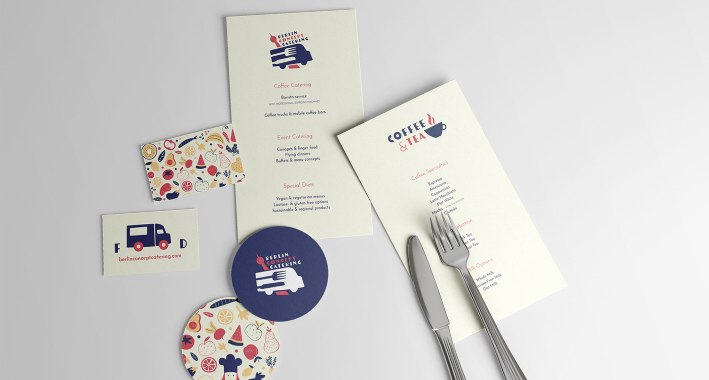
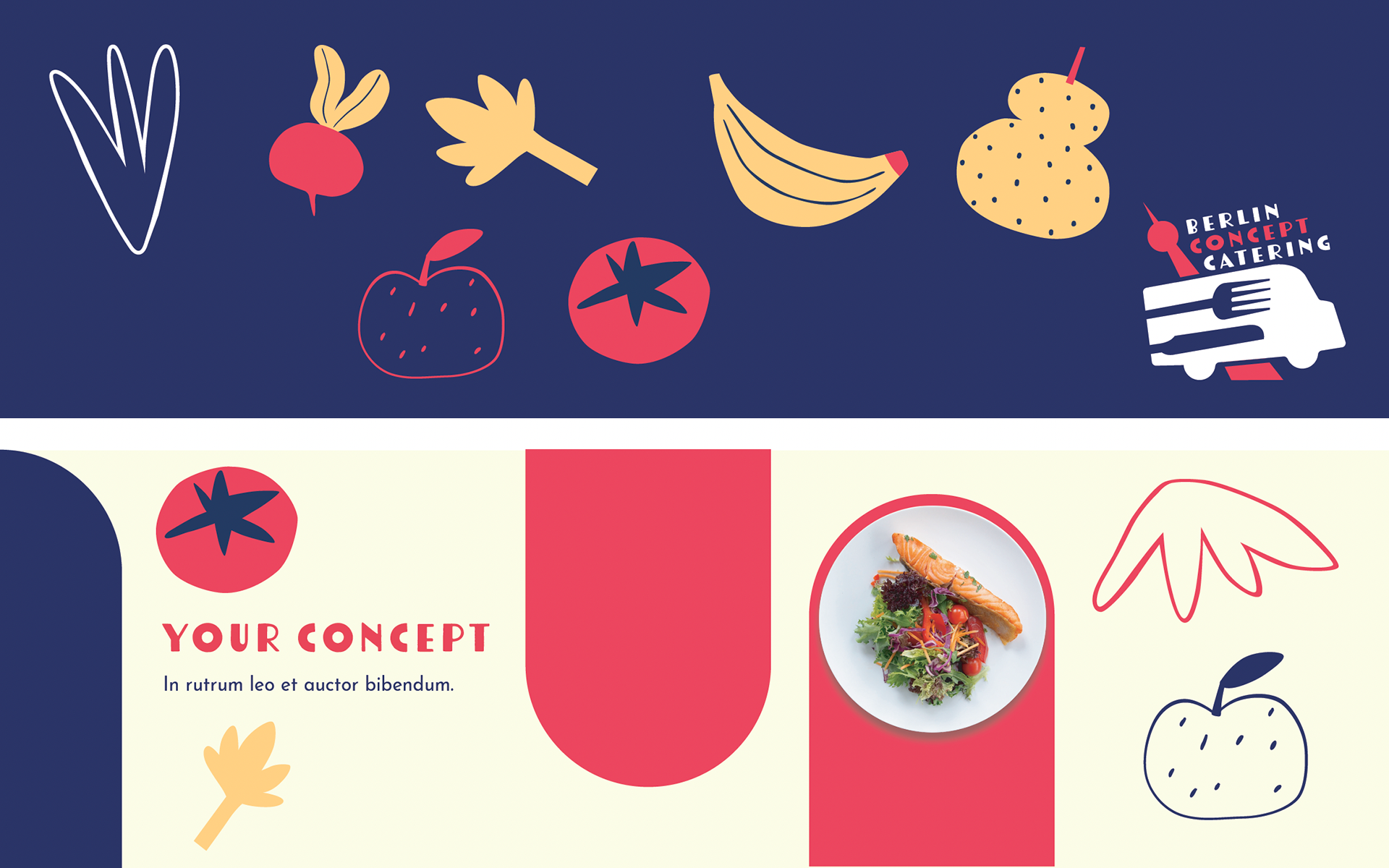
Berlin Concept Catering is a Berlin-based event catering company specializing in premium cuisine, with a strong focus on French-inspired food. At the core of the brand is a fleet of vintage Citroën HY food trucks, bringing a distinctive mix of authenticity, character and reimagined street food to events.
Problem
The objective was to develop a visual identity capable of clearly standing out in the competitive event catering market while reflecting the brand’s premium positioning.
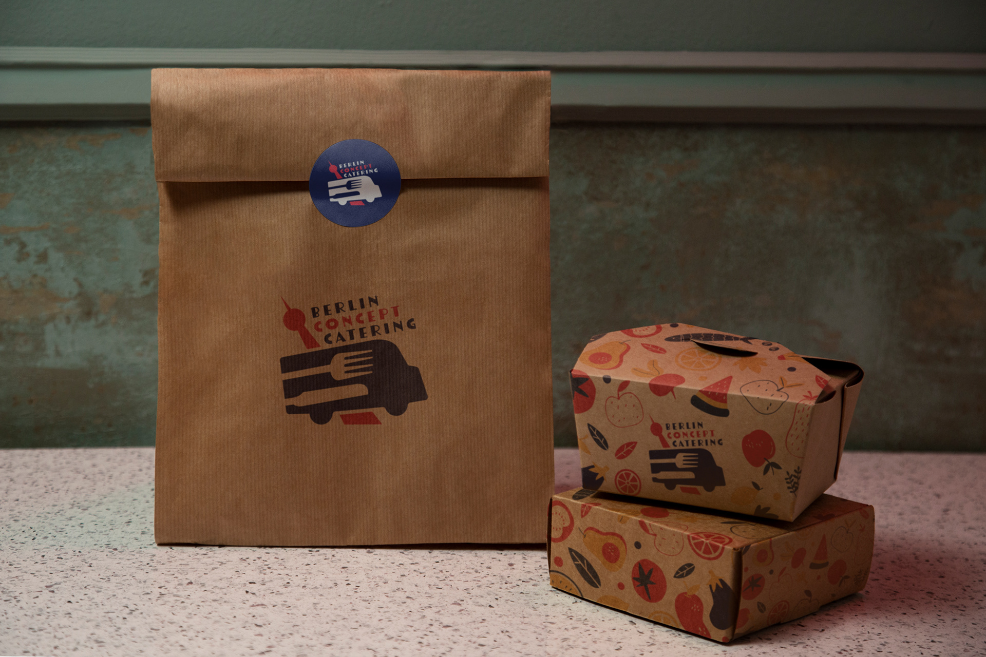
A key challenge was the length of the company name, which made the creation of a clear and balanced logotype particularly complex. The identity also needed to function across a wide range of applications, including food trucks, menus, packaging, digital communication and event signage.
Logotype
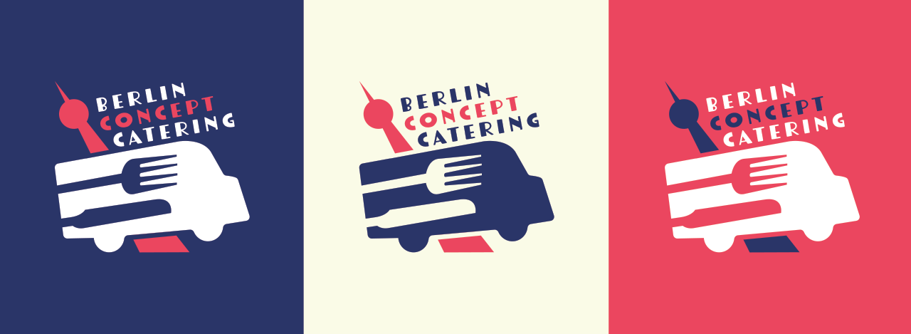
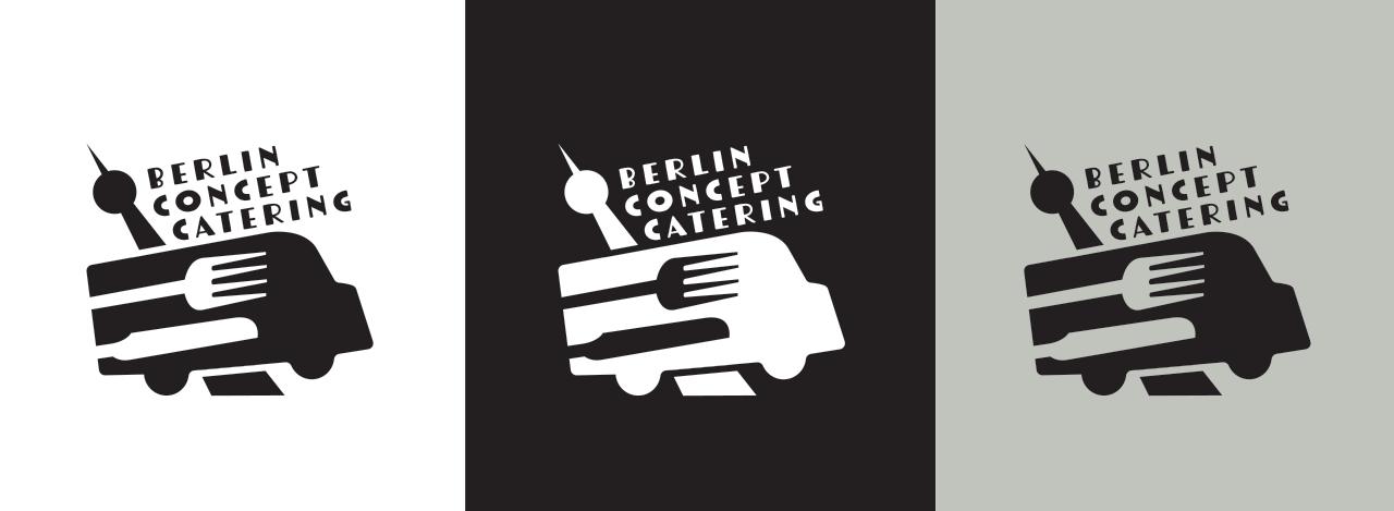
Designing the logotype presented a particular challenge due to the long name of the company. The goal was to create a mark that remained readable, compact and recognizable.
The final design combines three symbolic elements: a food truck, representing the core activity • a fork, referring to gastronomy and catering • the Berlin TV Tower (Fernsehturm), anchoring the brand within the city.
This simple yet expressive composition creates a distinctive visual signature that clearly communicates the brand’s identity.
Typography
The typographic system draws inspiration from 1930s Berlin visual culture, combined with contemporary typefaces to create a balance between heritage and modernity.
This approach reinforces the local cultural reference while maintaining a clean and contemporary visual language suitable for multiple applications.
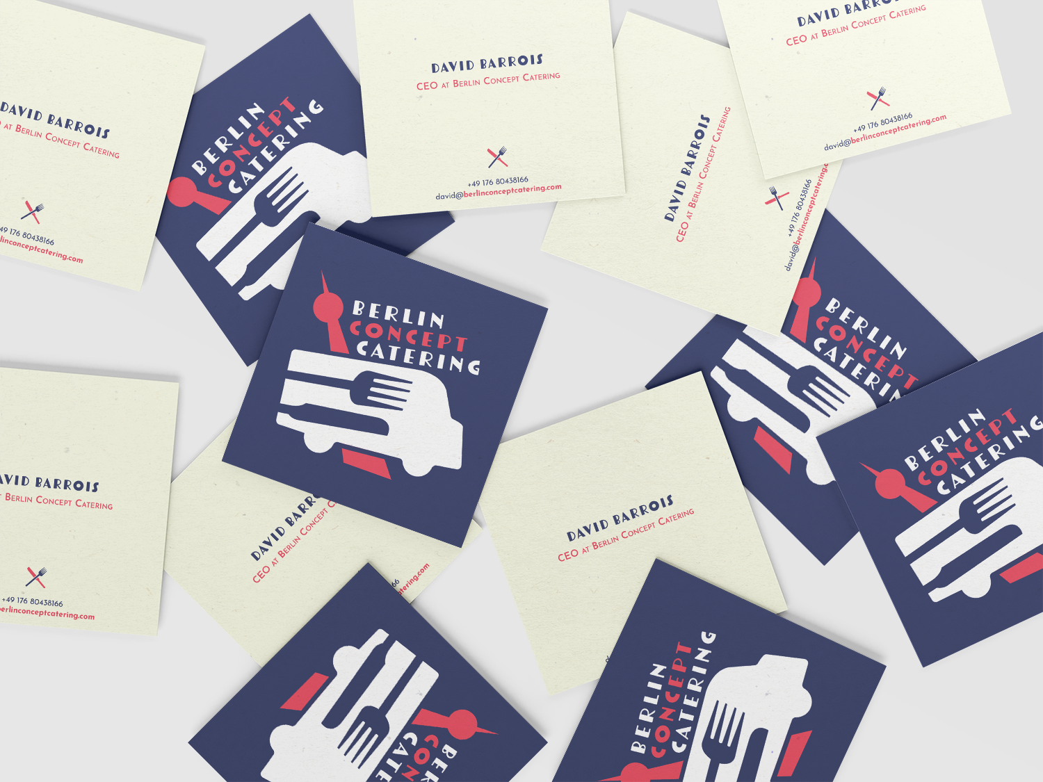
Color
The color palette combines a vivid red with subtle pink undertones, paired with deep blue and neutral tones.
This palette introduces energy and personality while subtly evoking French visual culture, reflecting the brand’s culinary inspiration.


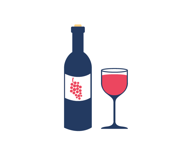


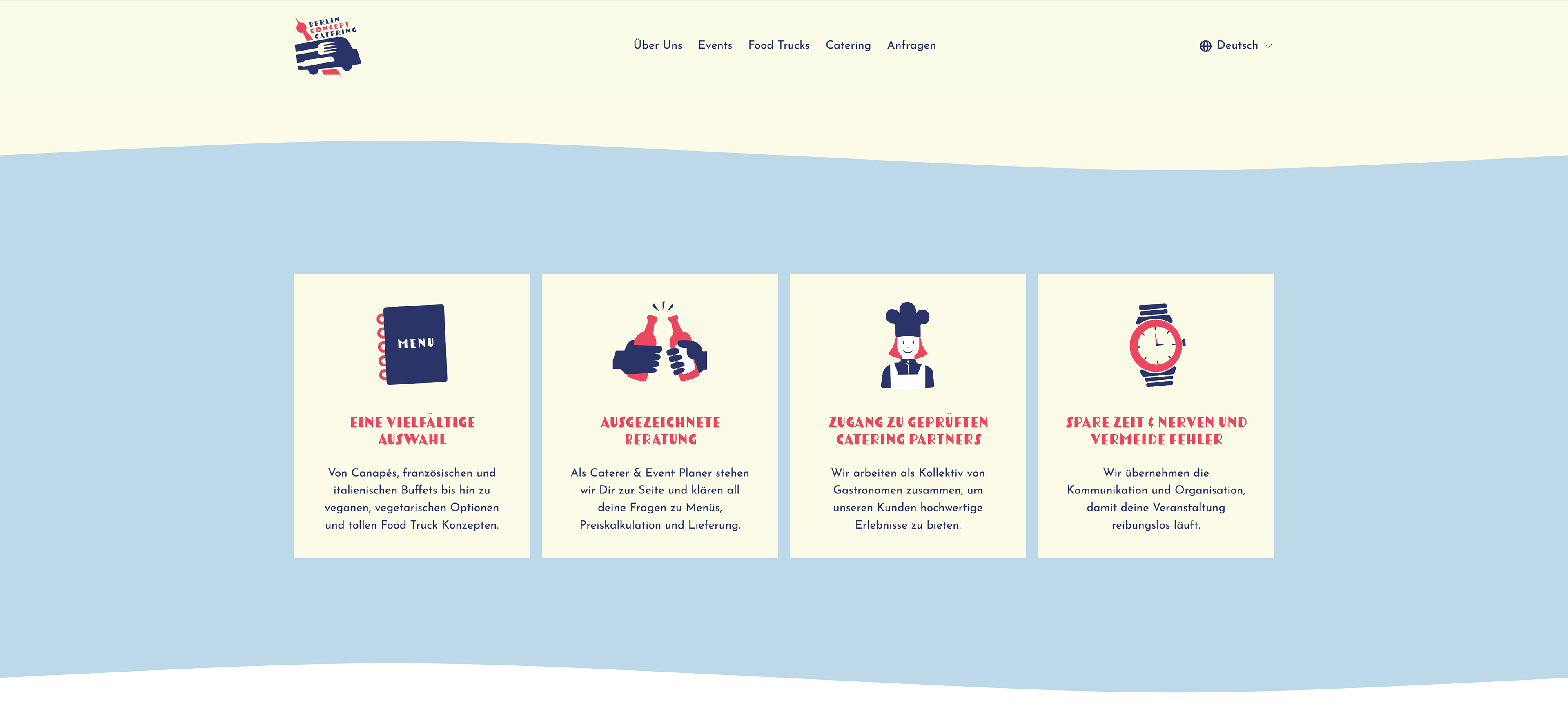
Iconography
A set of custom icons was developed to support the brand’s communication and services.
These icons create a consistent visual language that can be applied across menus, signage, digital communication and promotional materials.
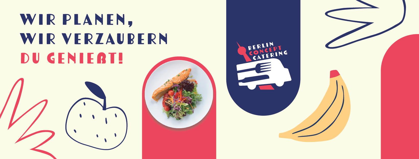
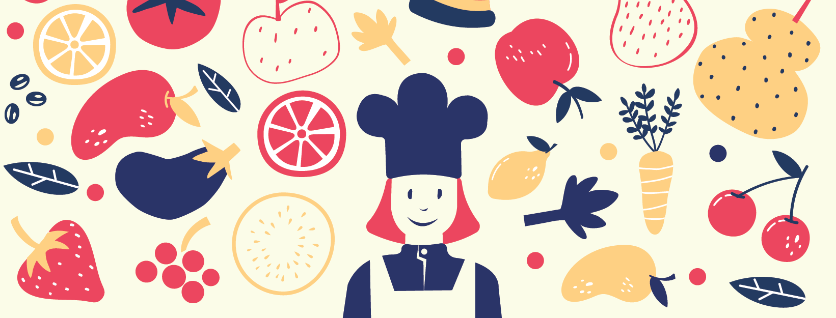
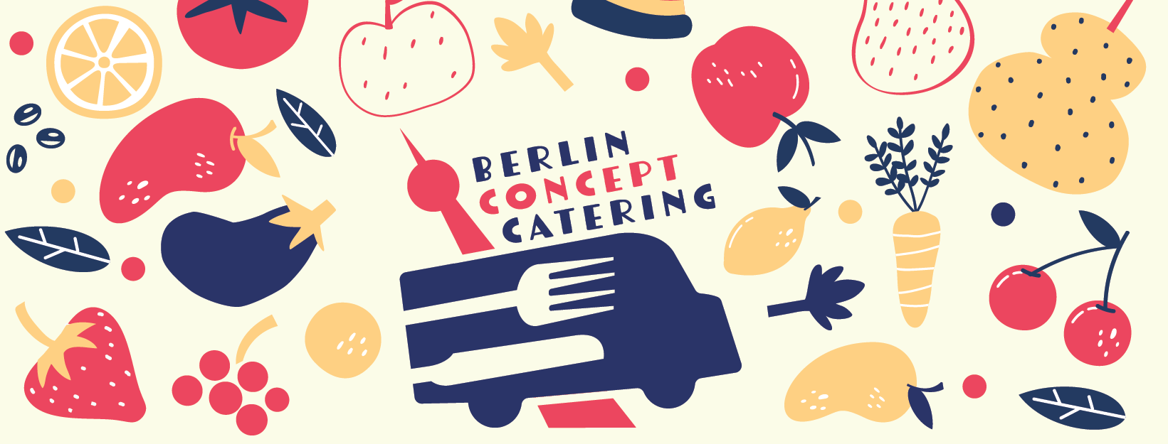
Illustration
The identity is extended through a series of hand-drawn digital illustrations.
These illustrations add warmth and personality to the brand while reinforcing its artisanal and creative character. They also help create a coherent visual universe across different applications.
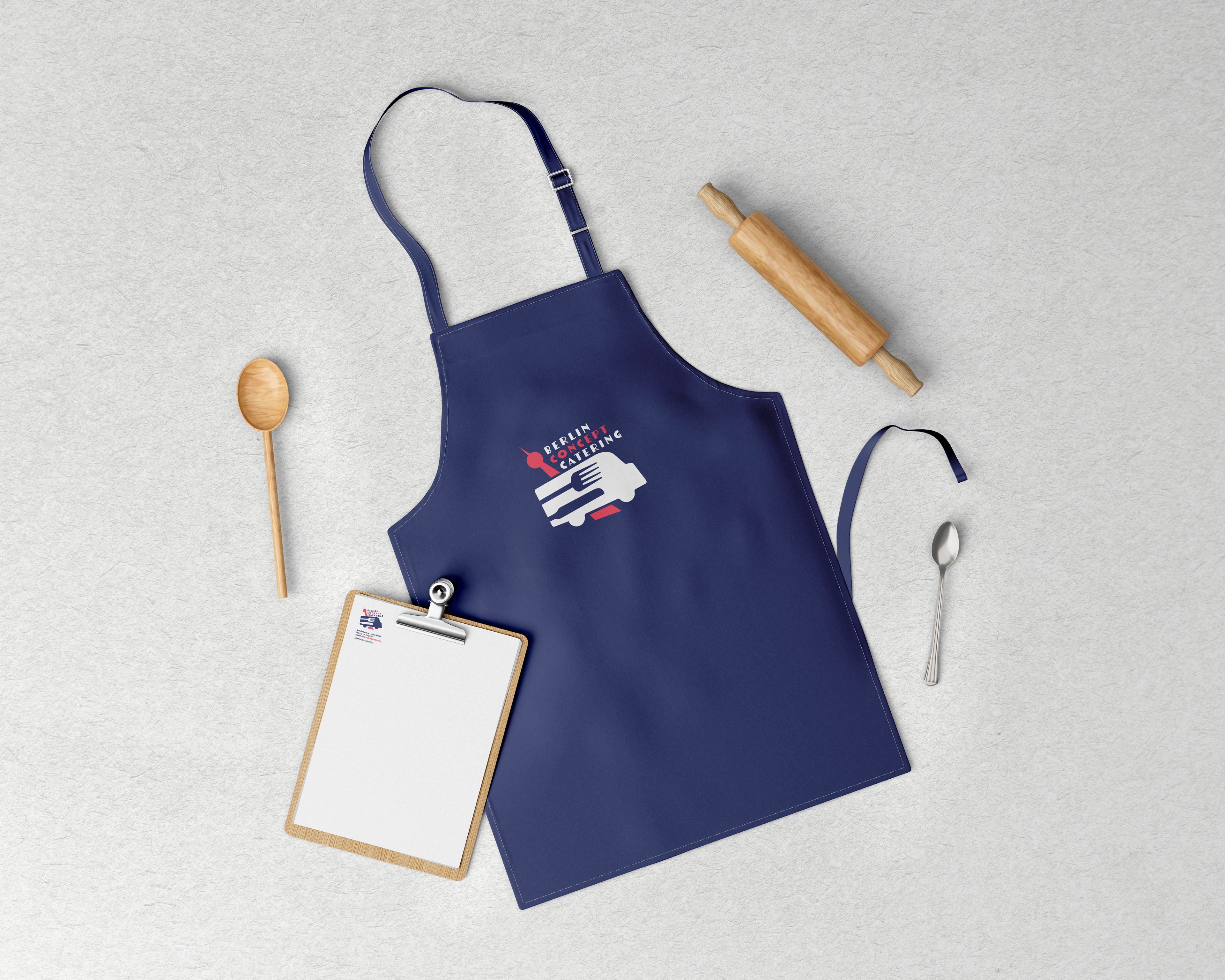
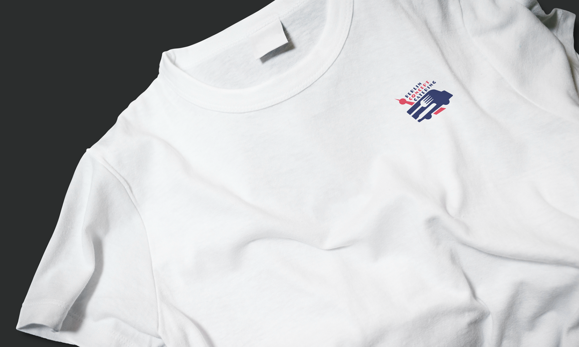
Applications
The visual identity is deployed across multiple formats:
food truck branding • menus and packaging • signage and event communication • digital platforms and advertising • corporate stationery

Solution
The project resulted in a bold and coherent visual identity system.
By combining a distinctive logo, expressive typography, vibrant colors and original illustrations, the brand establishes a strong and recognizable presence while clearly differentiating itself from competitors.