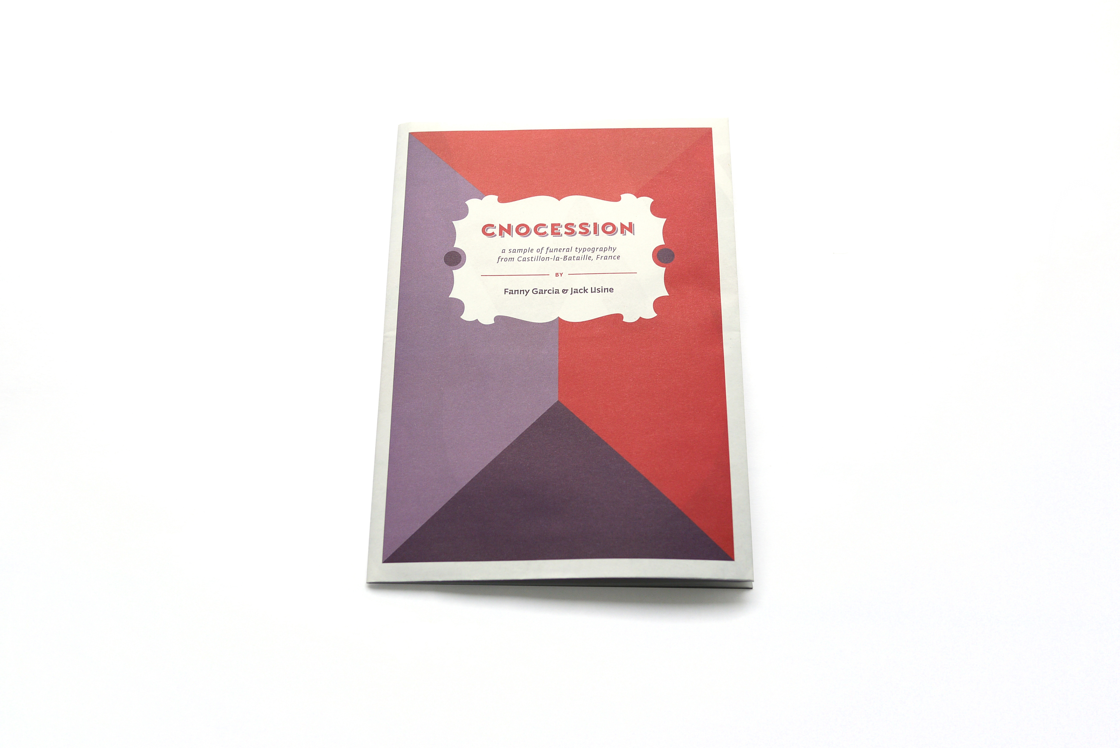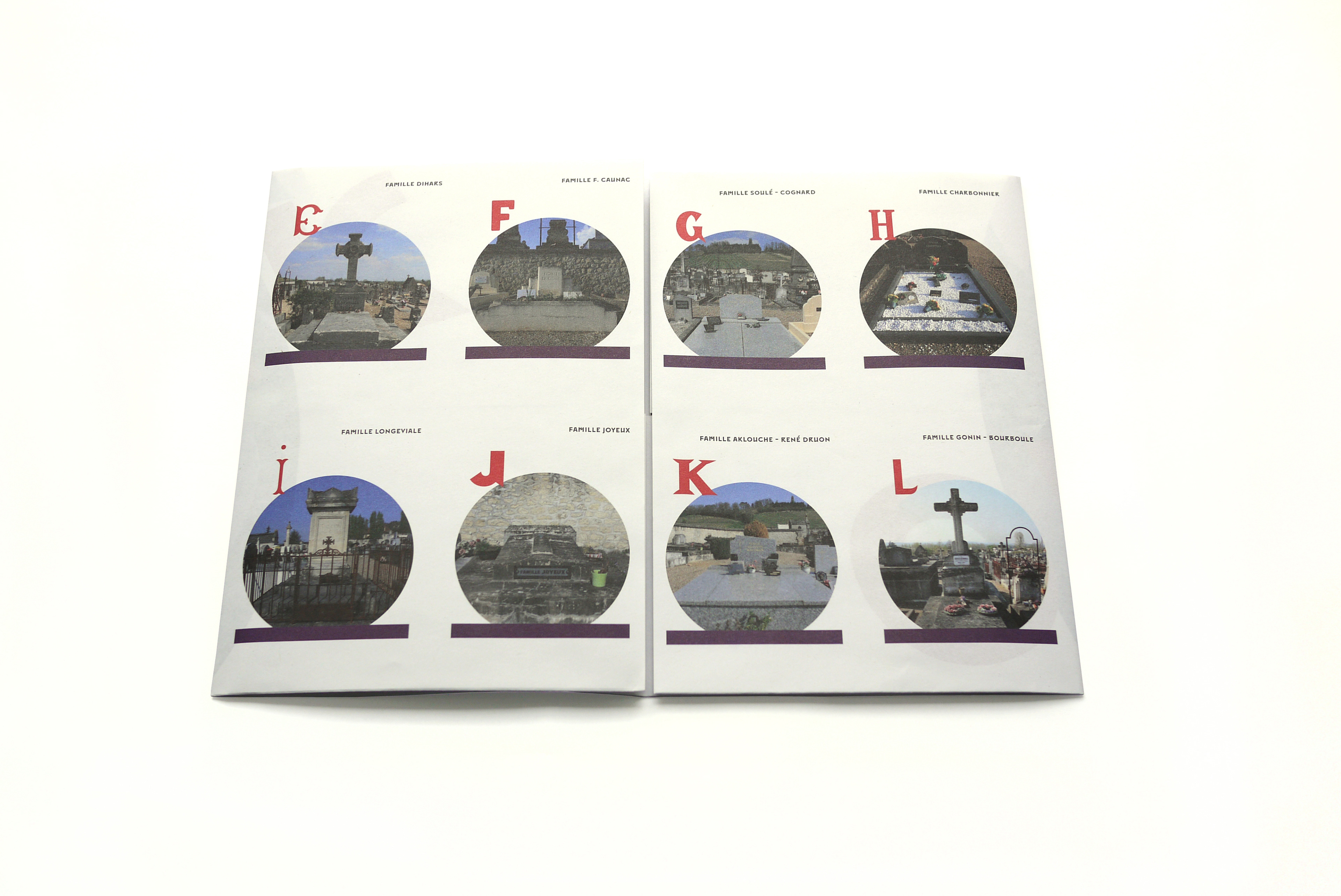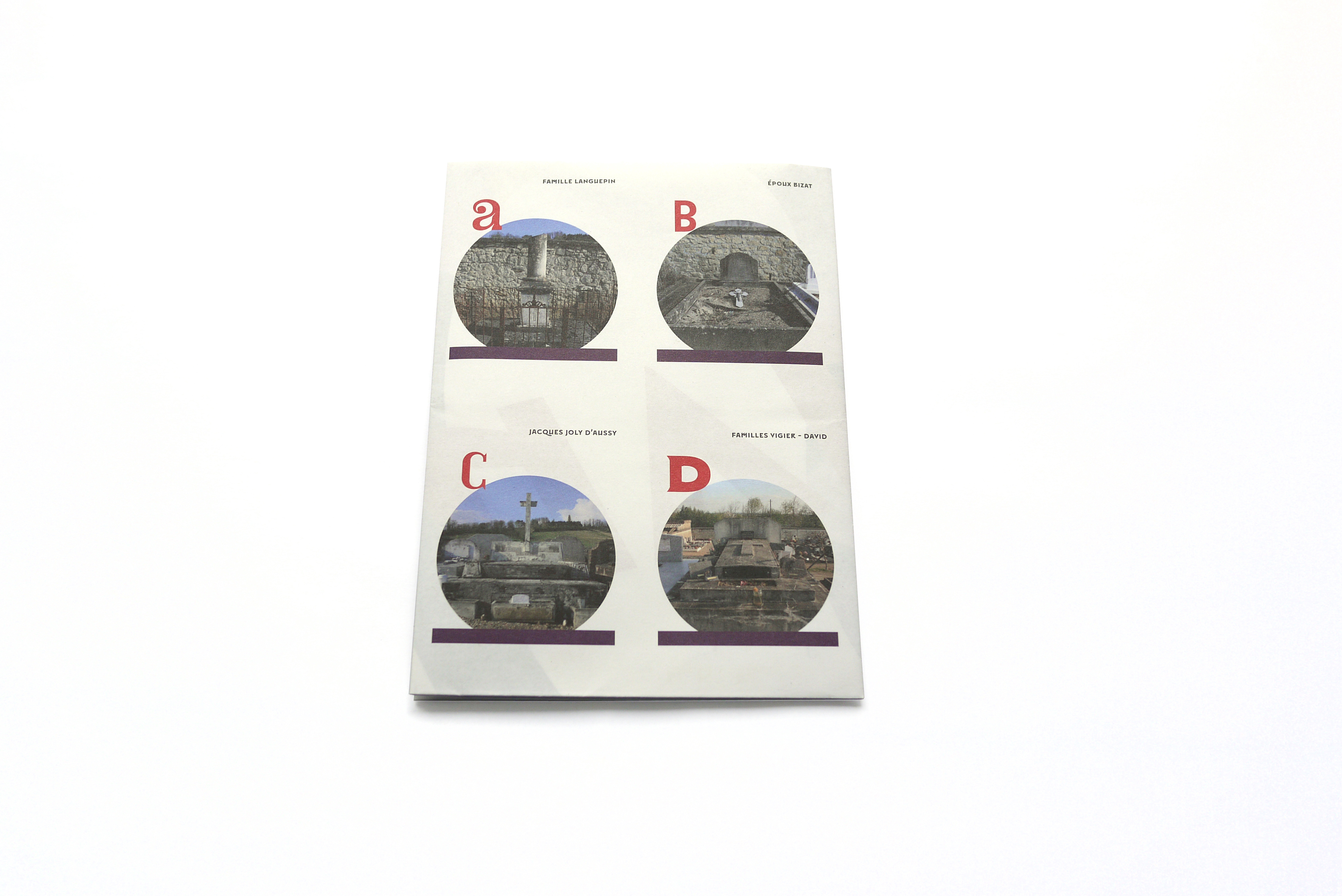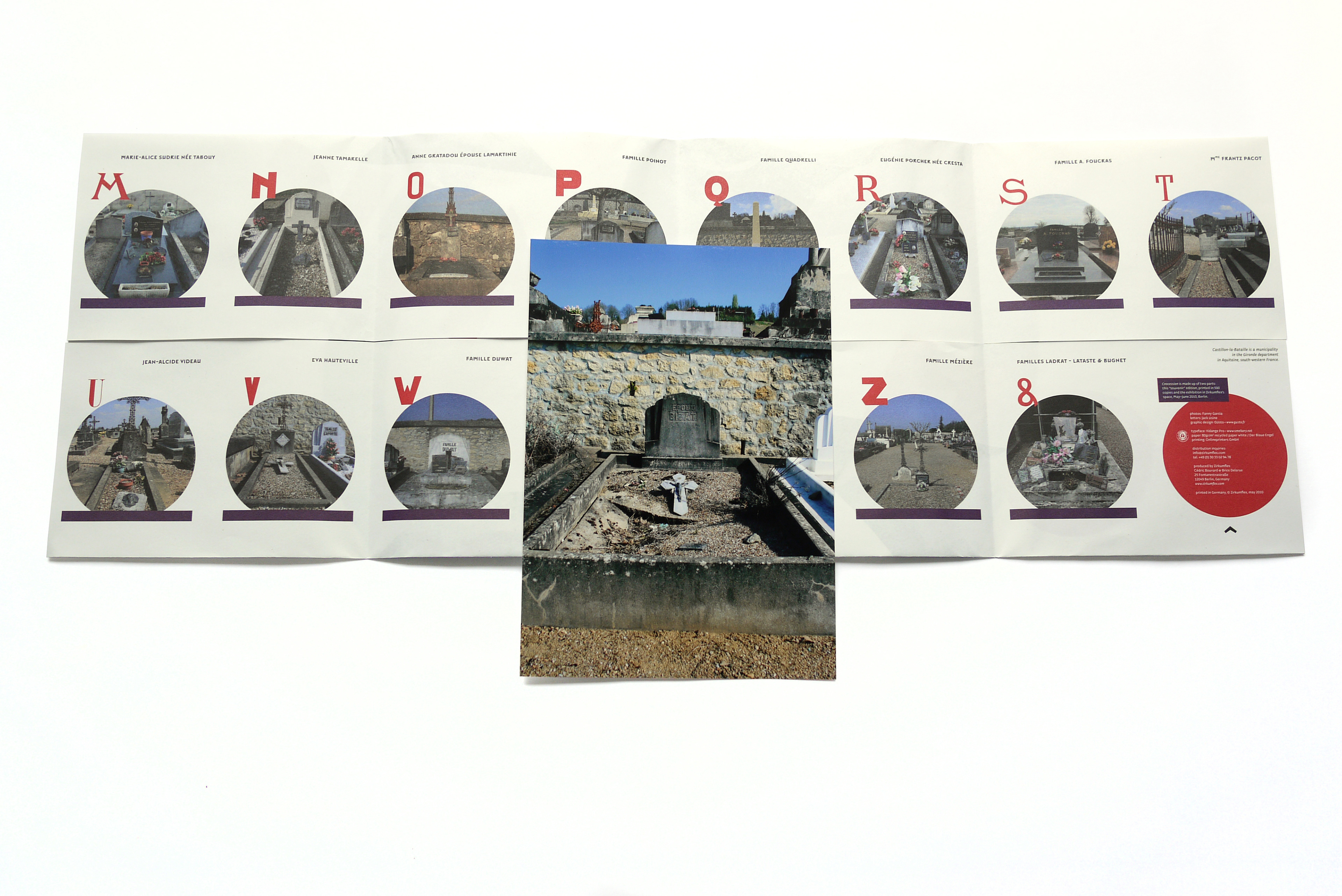


PROJECT
Cnocession
Cnocession
ROLE
Art Direction
YEAR
2013
CLIENT
Zirkumflex
Art Direction
YEAR
2013
CLIENT
Zirkumflex
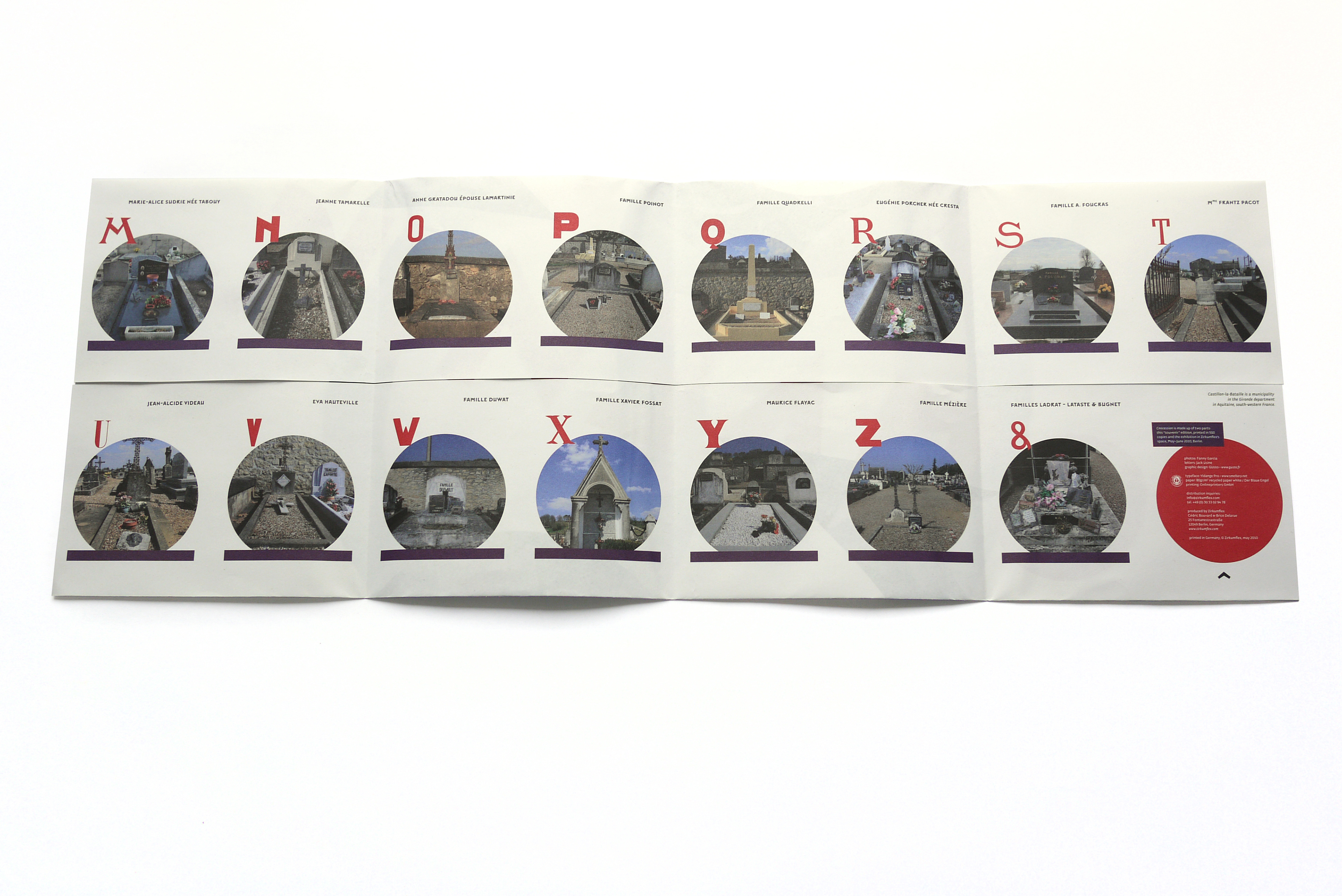
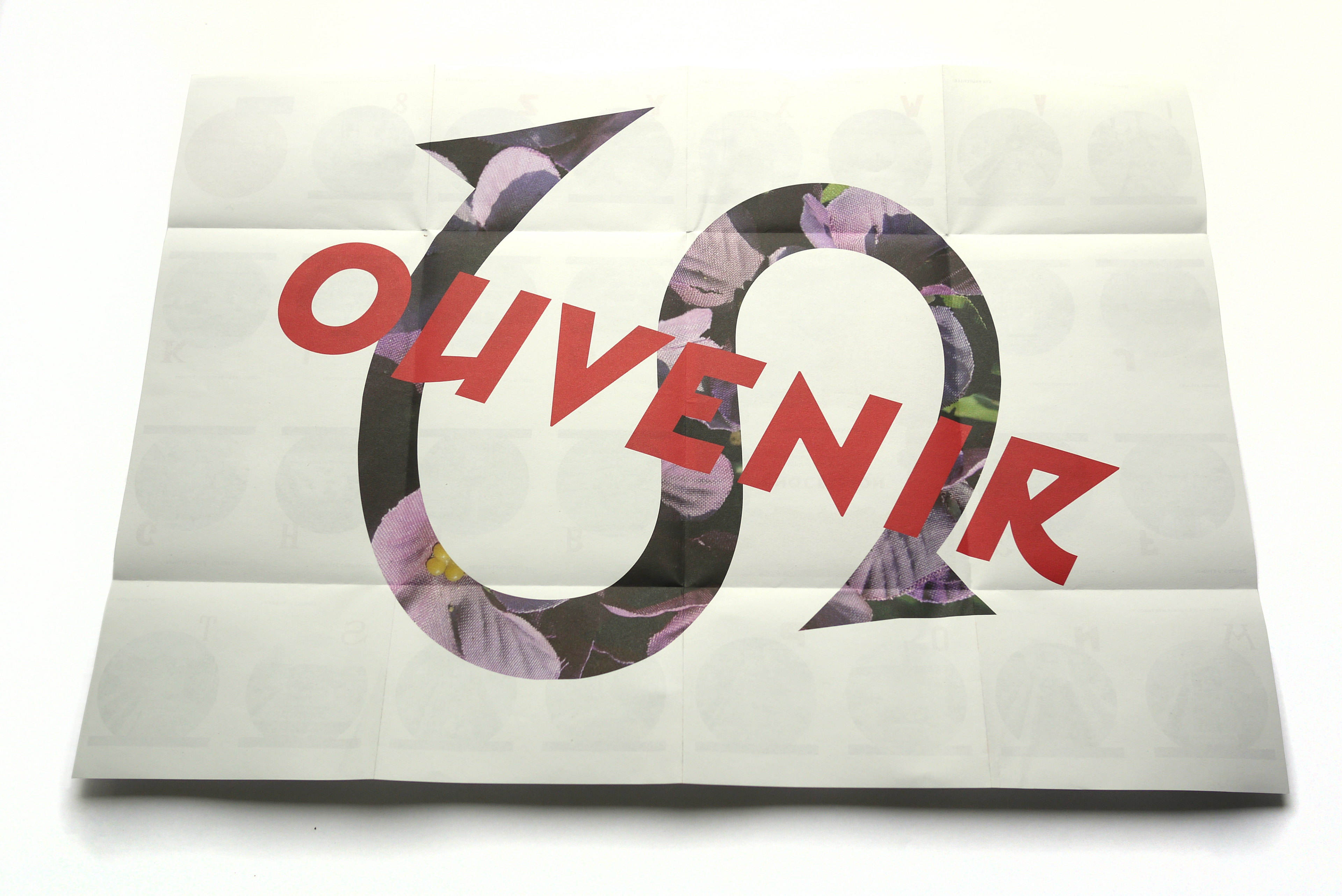
For the Souvenir Edition, produced in collaboration with designer Brice Delarue for the Zirkumflex platform, we explored how a book can become an explorer of memory, form, and material. The object is derived from the project Cnocession: letters traced from tombstones in the Castillon-la-Bataille cemetery, transformed into a graphic publication. With its 15 × 21 cm closed format (59.7 × 42 cm open), printed on 80 g/m² recycled paper and limited to 500 copies, the edition embodies a clear editorial stance. The graphic design (developed by Studio GUsto) plays on the duality between funerary gravity and typographic rebirth — staging engraved forms through layers, transparencies, and subtle contrasts. We sought to make the publication an active space: the reader is no longer a simple spectator but an explorer of printed signs. The use of typography sourced from a funerary context to create an “alphabet” questions the value of forms as a visual heritage. Thus, this edition reflects our approach — blending typography, photography, and editorial design to give material form to a visual narrative.